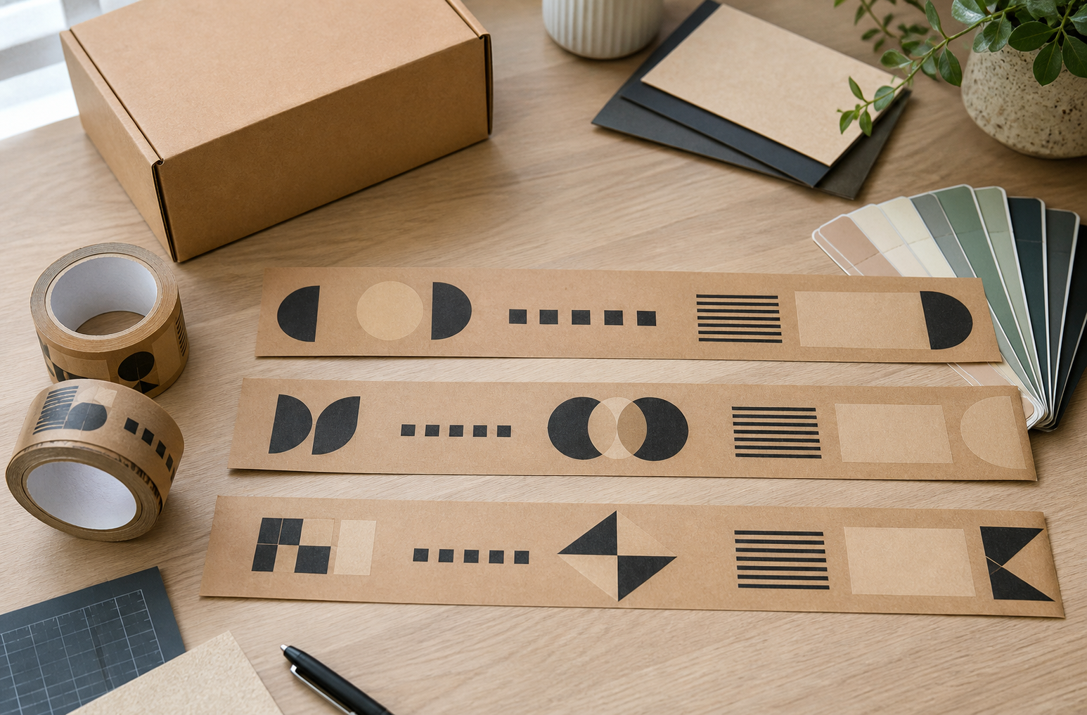
A custom tape design has limited space and repeats around a three-dimensional box. That makes content selection more important than adding every available brand element. In most cases, one recognizable logo plus one short supporting element will communicate more clearly than a crowded line of copy.
This guide focuses on what the tape should say. File format, color references, proofing, and repeat construction are handled in separate artwork guides.
Start Custom Tape Design With One Communication Job
Choose the primary communication goal before arranging artwork.
| Goal | Strong starting content | Content to question |
|---|---|---|
| Recognition | Logo or distinctive wordmark | Long company description |
| Recall | Logo plus short domain | Several social handles |
| Customer experience | Brief thank-you or opening message | Multi-sentence brand story |
| Handling communication | Short, approved instruction | Vague or unverified claims |
| Campaign | Campaign mark or concise seasonal phrase | Offer details likely to expire |
If the tape’s primary job is carton closure and brand recognition, the logo normally deserves the highest visual priority.
Logo Only: The Safest Default
A logo-only design is often the most durable option. It is less likely to become obsolete than a promotion, social handle, or campaign message. It also gives the mark more room to remain readable as the strip bends over corners and crosses the carton seam.
Logo-only tape is a strong choice when:
- the brand is already recognizable;
- boxes vary in size;
- tape inventory may remain in use for several months;
- the website or offer changes frequently;
- operations want one evergreen design.
The simple custom tape design guide helps teams keep the broader artwork specification controlled.
Should You Put a Website URL on Tape?
A website URL can help a recipient recall the brand when the logo does not include a clear name. It works best when the domain is short, stable, and easy to read.
Use a URL when:
- the domain is a durable brand asset;
- it can be set large enough for the tape width;
- the tape may be seen away from the shipping label;
- the destination page will remain active.
Skip or shorten the URL when:
- it contains a long path, tracking code, or punctuation-heavy structure;
- the logo already displays the domain clearly;
- the brand expects a migration;
- adding it forces the logo and message to become too small.
Do not assume a printed URL will be scanned or typed. Treat it as a recognition aid, not a measurable conversion promise.
Taglines and Thank-You Messages
A tagline can add context when the brand name does not explain the product category. A thank-you message can support the unboxing moment. Both need ruthless editing.
Good tape copy is:
- brief enough to understand in one glance;
- evergreen for the expected inventory life;
- readable without rotating the parcel repeatedly;
- consistent with the brand voice;
- approved by the owner responsible for public claims.
Avoid filler such as “premium quality” unless it carries a defined, supportable meaning. Avoid time-sensitive coupon codes on tape that may remain in storage after the offer ends.
Social Handles, QR Codes, and Contact Details
Social handles change more often than domains and can tie packaging to one platform. Use one only when it is central to the customer journey and stable enough for the full tape inventory cycle.
QR codes require more caution. Tape curves, wrinkles, seams, print limits, and cutting can affect scannability. If a QR code is proposed:
- ask the supplier whether the requested size and print method are suitable;
- keep clear space around the code;
- place it where a complete repeat can appear on a flat panel;
- test printed samples on actual cartons with multiple devices;
- provide a human-readable fallback such as a short domain.
Do not print personal email addresses, phone numbers, or return instructions unless the business has a controlled reason and owner for that information.
Handling and Security Messages
Messages such as “Fragile,” “Do Not Accept If Seal Is Broken,” or environmental claims can create operational or legal expectations. Printed words do not prove that the package, tape, or process meets the claim.
Before printing handling or security language, confirm:
- who owns the instruction;
- whether carriers or recipients will understand it;
- whether the product and packing process support it;
- whether required labels or regulated markings belong elsewhere;
- how the wording will be reviewed when conditions change.
Keep shipping-label data and regulated information on the approved label system rather than relying on a repeating decorative tape pattern.
Build a Content Hierarchy
Use three levels at most:
- Primary: logo or brand name.
- Secondary: short URL, tagline, or thank-you message.
- Optional: one controlled instruction or campaign element.
If two elements compete for attention, remove one before shrinking both. Then review the design using the logo readability on kraft tape checklist.
Plan for the Repeat
Content decisions cannot be separated from repetition. A message may be readable in the artwork file but disappear when the strip is cut or wrapped around a small box.
Map the design onto representative cut lengths and carton panels. The repeating logo pattern guide explains how repeat spacing changes what recipients actually see.
BrandTapeCo Artwork Context
BrandTapeCo offers one-color, two-color, and full-color printing on standard or reinforced water-activated kraft paper tape in 1.89 in (48 mm) and 2.36 in (60 mm) widths. A PNG or JPG can create the on-screen preview; PDF is accepted for production artwork. The site states that white-only logos are not supported and that a digital production proof must be approved before printing.
Prepare a clean source file using the vector logo file guide and review the final proof rather than treating the on-screen preview as production approval.
Frequently Asked Questions
Is a logo enough for custom packing tape?
Yes. A clear logo-only repeat is often more durable and readable than a crowded design.
Should a custom tape design include a URL?
Include a short, stable domain when it adds recognition and remains readable. Skip it if it crowds the logo.
Can I print a QR code on packing tape?
Ask the supplier about print suitability and test real samples on flat carton areas. Always provide a readable fallback.
Should I put “fragile” on custom tape?
Only as part of an approved handling system. Printed tape does not replace proper packing, carrier labels, or required instructions.
How many messages should appear in one repeat?
Usually one logo plus one short supporting element is enough. Add more only when hierarchy and readability remain clear.
Finalize the Information Hierarchy
Before approving the artwork, cover everything except the most important element. If the design no longer communicates, the hierarchy is too weak. Restore the logo first, then add only the URL or short message that still earns its space.
Use the production proof to check that hierarchy across a complete repeat and on the selected tape width. A restrained design is easier to recognize, easier to keep current, and less likely to leave unusable inventory after a campaign changes.
Review Custom Printing Options
Compare one-color, two-color, and full-color routes against the selected width and artwork before ordering.
Next step: review custom printed packing tape options for current configurations and order-specific details.