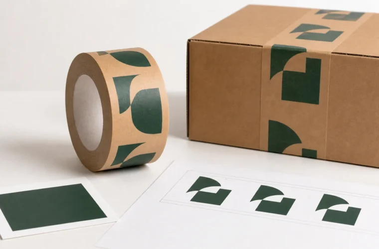
A logo that looks crisp on a white monitor can lose detail on brown kraft paper, across a carton seam or when a printed repeat is cut mid-mark. Readability is therefore a packaging decision, not just an artwork decision. The practical test is whether someone can recognize the brand on the sealed box at the distance and angle at which the box will normally be seen.
First choose a tape width that fits the carton
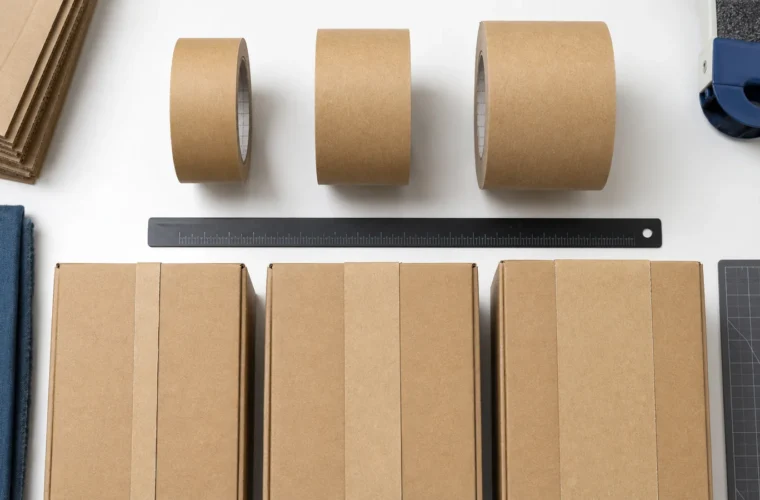
BrandTapeCo offers custom-printed water-activated tape in 48 mm and 60 mm widths. Both standard online rolls are 50 m long. Those are the only available printed widths; 72 mm and other widths are not offered. Decide between 48 mm and 60 mm using your actual carton seams and the amount of visible logo area you need. Ask the print team to confirm the usable print area rather than assuming the artwork can touch both tape edges.
Cut a paper strip to the proposed width and place it over a sealed sample carton. Where does the mark land? Is part of it hidden around a corner, under a shipping label, or across an uneven seam? A wider strip may give a larger visible mark on one carton, but the larger-looking design is not automatically the better seal or the better fit for every box.
Design for contrast on kraft, not on a white artboard
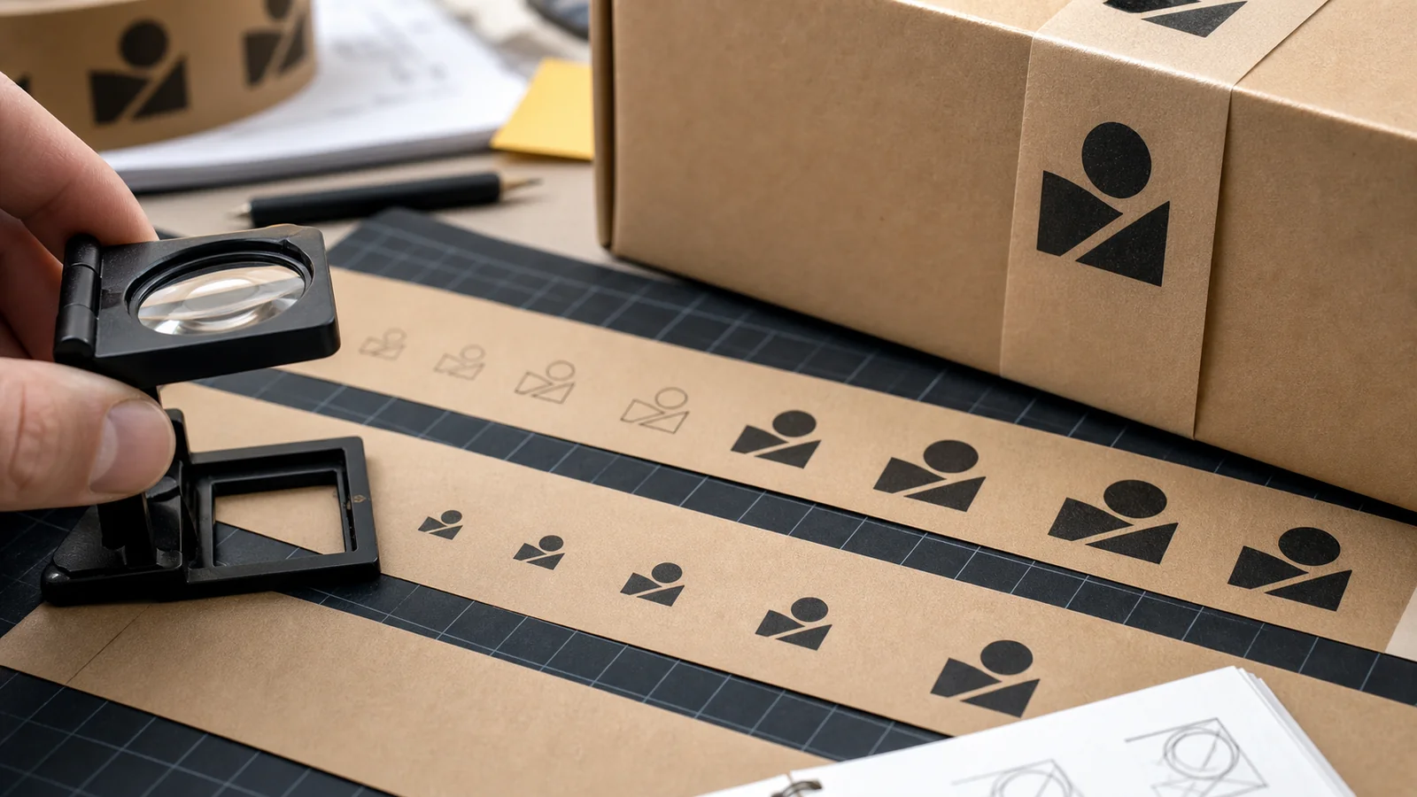
Start with a high-contrast version of the mark and remove fine decorative detail that does not survive at the intended print size. Check thin lines, small type, registered symbols and negative-space gaps at the size they will appear on the tape. If the logo needs an exact brand color, provide a reference and ask what can be reproduced on the selected kraft stock. A screen preview cannot guarantee the same appearance on paper under different lighting.
Keep critical words and the main symbol clear of the strip edges and any area the supplier identifies as a print tolerance. Do not choose a specific minimum font size or line thickness from a generic web article; ask for a proof at the real tape width and have the supplier confirm production limits for your artwork and print option.
Review a complete repeat, including the cut points
Printed tape is dispensed in different strip lengths. A repeat that looks balanced on an uncut roll can create half a logo on a short carton. On the proof, mark the direction in which the tape will run, the repeat spacing and where a normal strip may begin or end. If you need the brand name to appear fully on a typical box, measure those cartons and discuss the repeat with the artwork team before approval. No repeat pattern can guarantee every cut will contain one complete mark unless that is checked against your actual strip lengths.
For a two-color or full-color design, review the smallest overlapping details at actual size. For a one-color design, see whether simplifying the artwork improves recognition. These are print choices available for the product, not a claim that any particular combination will reproduce perfectly without a proof.
A five-minute proof and carton check
- Print the digital proof at 100% scale, without “fit to page,” and verify the stated width with a ruler.
- Read all text aloud. Check spelling, orientation, color references, legal marks and the approved logo revision.
- Place the scaled strip on the intended carton at its normal seam and look at it from normal handling distance. Test at least a narrow and a wide carton if both are used.
- Mark where labels, folds and cut points obscure the design. If the problem is recurring, adjust the logo scale, clear space or repeat before approving the proof.
- If color, surface appearance or sealing performance is important, request a physical sample and test it with your cartons and packing setup. Keep the result and approved file version together.
A digital proof checks layout; it does not prove how the paper, ink and water-activated adhesive will behave in your operation. A sample review is especially worthwhile when your carton finish, lighting or handling conditions differ from ordinary corrugated boxes.
Ordering without a surprise
The standard online minimum is five rolls per design and color configuration. If you change the logo or colorway, treat that as a separate configuration when calculating quantity. A different roll length can be raised with sales for feasibility and a separate written quote, but it is not a standard online selection. Review the current product options and send your artwork, carton details and preferred 48 mm or 60 mm width through the contact page if you need a pre-order review.