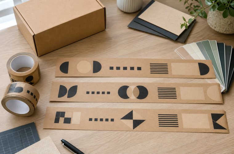
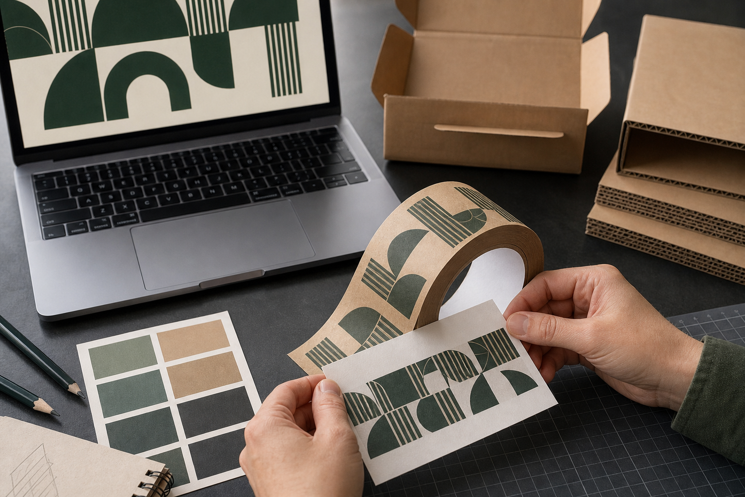
Printed kraft paper tape does not give artwork a neutral white canvas. The natural brown surface remains part of the finished design, influencing contrast, color appearance, fine detail, and the overall tone of the package.
That is often the point. Brown kraft paper can support a restrained, material-forward look on plain corrugated boxes. It can also make a pale logo disappear or shift the way a familiar brand color appears.
The safest design process treats the tape background as an active color from the first draft—not as an invisible layer added after the artwork is approved.
Start With the Actual Kraft Background
A logo file displayed on a bright computer screen is usually previewed against white or transparency. Neither view shows exactly how it will read on brown kraft paper.
Place the artwork over a representative kraft color before deciding that the design is finished. This reveals several problems early:
- low contrast between medium-tone colors and the paper;
- thin lines that become visually weak;
- negative space that no longer looks white;
- photographs or gradients that rely on a bright base;
- small type that competes with the paper texture;
- brand colors that appear warmer or duller against brown.
The preview is a planning tool, not a production guarantee. Paper shade, ink behavior, printing process, and supplier controls still need to be confirmed during proof review.
Brown Kraft Is a Color, Not Empty Space
If an artwork file has a transparent background, the kraft paper becomes the background in the finished tape. Transparent areas do not print white automatically.
Consider a simple black wordmark. On a white screen, it appears as black plus white. On natural kraft, it becomes black plus brown. That can look strong because the dark mark has clear contrast and the unprinted paper becomes part of the design.
Now consider a beige, tan, muted orange, or light gray logo. Those colors may sit close to the kraft tone and lose separation. The design may need a darker version, a simplified outline, a different approved color, or another tape background.
Brand teams should not make that change informally. If the tape uses a different logo colorway from other materials, document it as an approved packaging application.
How Common Artwork Choices Behave on Kraft
| Artwork choice | Likely design issue | Practical review |
|---|---|---|
| Black or very dark logo | Usually creates strong visual separation | Check small counters, fine lines, and repeat spacing |
| Mid-tone brand color | May blend into the brown background | Preview on kraft and request an order-specific proof |
| Pale logo | Can lose contrast | Test an approved darker colorway or another background |
| Transparent/negative space | Kraft shows through | Make sure the design still reads when “white” becomes brown |
| Small text | Paper texture and print tolerances can reduce clarity | Enlarge, simplify, or remove nonessential copy |
| Full-color image | Colors and light areas may not behave like a white-screen preview | Confirm the printing setup and review the production proof carefully |
BrandTapeCo currently offers one-color, two-color, and full-color printing. The number of available print colors does not remove the need to design for the kraft substrate.
Contrast Matters More Than Detail
Tape is viewed at several distances: close up at the packing bench, at arm’s length when the carton is carried, and farther away during delivery. The core brand mark should survive all three.
Strong designs usually have:
- a recognizable logo silhouette;
- enough separation from the kraft background;
- line weights that remain visible at tape size;
- limited supporting copy;
- repeat spacing that gives each mark room;
- consistent orientation on the carton.
Do not use every available inch. A crowded strip can make the logo less noticeable than a simpler repeated mark.
The custom printed gummed tape artwork guide provides a structured review for logo size, spacing, artwork files, and proof approval.
One Color, Two Colors, or Full Color?
One-color printing
One-color artwork can be effective on kraft when the selected ink has clear contrast. It also makes the repeat easy to inspect and reduces the number of visual relationships the designer must control.
Simple does not mean generic. A distinctive logo, intentional spacing, and a well-chosen color can be enough.
Two-color printing
Two colors can separate the logo from a message or add an accent. The two inks must also work with each other and with the kraft background. A secondary color that looked clear on white may become weak on brown.
Full-color printing
Full color supports more complex artwork, but complexity increases the importance of substrate-aware proof review. Buyers should confirm how light areas, gradients, photographs, and brand colors are expected to reproduce on the selected material.
Use the full-color custom gummed tape planning guide to prepare the artwork and supplier questions without assuming that a screen preview is a color guarantee.
White Artwork Needs Specific Confirmation
Do not assume that transparent areas or white elements will produce an opaque white mark on natural kraft.
BrandTapeCo’s current product interface states that white-only logos are not supported. If an artwork file depends on white, ask for an order-specific review before building the entire design around that assumption. The supplier needs to confirm what is printable, how the file should be prepared, and what the proof represents.
When white is essential to the brand system, possible design paths may include an approved darker logo colorway or another confirmed tape configuration. Do not promise a white ink, underbase, or material option unless the current supplier specification confirms it.
Use Color References Correctly
Pantone or CMYK references help communicate intent, but they do not turn a kraft paper surface into a calibrated white background.
Record:
- the approved brand color reference;
- the intended tape material and background;
- whether the reference is a target or a required tolerance;
- who can approve a packaging-specific variation;
- which proof or sample will control production.
The packaging tape color reference guide explains how to separate a useful color reference from an unsupported exact-match promise.
Design the Repeat on the Selected Width
BrandTapeCo currently offers 1.89 in (48 mm) and 2.36 in (60 mm) tape widths. The usable design area changes with width, so the artwork should not be approved before the tape configuration is chosen.
A wider tape may provide more vertical space, but width should be selected around carton seam coverage, material, and dispenser compatibility—not artwork alone.
Review the repeat at actual size:
- Place the logo within the selected tape width.
- Check the smallest readable text and thinnest line.
- Set a repeat gap that prevents visual crowding.
- Preview multiple repeats, not one isolated mark.
- Place the strip on representative small and large cartons.
- Check how the logo crosses seams, corners, and flaps.
Screen Preview vs Production Proof
An online preview helps a buyer understand placement and repeat. It is not the final authority for color, material behavior, print tolerances, or production output.
BrandTapeCo provides a digital production proof before printing. Treat that approval as a controlled handoff:
- verify the correct logo version;
- confirm the tape material and width;
- check colors and references;
- inspect spelling and small text;
- review repeat direction and spacing;
- record the person and version approved.
Use the custom tape proof approval checklist before releasing artwork.
A Practical Kraft-Tape Design Review
| Check | Pass question |
|---|---|
| Background | Is the artwork shown on a representative kraft tone rather than white? |
| Contrast | Can the primary mark be recognized quickly? |
| Scale | Are the logo and any text readable at actual tape width? |
| Repeat | Does the pattern feel intentional across several repeats? |
| Color | Are references and approval authority documented? |
| Carton | Has the strip been previewed on representative boxes? |
| Proof | Have material, width, print option, artwork version, and spacing been checked together? |
Frequently Asked Questions
Does kraft paper change printed colors?
The natural brown background changes how colors are perceived and may show through transparent or unprinted areas. Confirm the selected artwork, material, printing setup, and production proof together.
What logo color works best on brown kraft tape?
High-contrast colors are usually easier to read, but there is no universal best color. Test an approved logo colorway on the intended kraft background and at actual size.
Can I use a transparent PNG for the preview?
BrandTapeCo’s online preview accepts PNG or JPG files. A transparent PNG can help show the kraft background through the unprinted areas. Preferred production files are AI, PDF, SVG, or EPS.
Can BrandTapeCo print a white-only logo on kraft tape?
The current product interface states that white-only logos are not supported. Submit the artwork for an order-specific review instead of assuming white reproduction.
Is full-color printing better than one-color printing?
Not automatically. Full color fits complex artwork; one color can be clearer on a narrow repeated surface. Choose the simplest option that preserves the approved design intent.
Should I approve the design from the online preview?
Use the online preview for layout reference. BrandTapeCo requires approval of a digital production proof before printing.
Conclusion
Printed kraft paper tape works best when the brown paper is treated as part of the artwork. Build contrast deliberately, simplify fine detail, preview the true repeat at actual width, and review color expectations against the selected material.
If the natural kraft look fits your packaging, explore BrandTapeCo’s custom printed kraft paper tape and submit the approved logo colorway for proof review before production.
Next step: review custom printed packing tape options for current configurations and order-specific details.